


Designing complex forms
A pre-construction platform for the German market, built from zero for a client in Oslo. At the centre of it is one very deep quote form, designed for an estimator at a desk and rebuilt for a worker with one hand free.
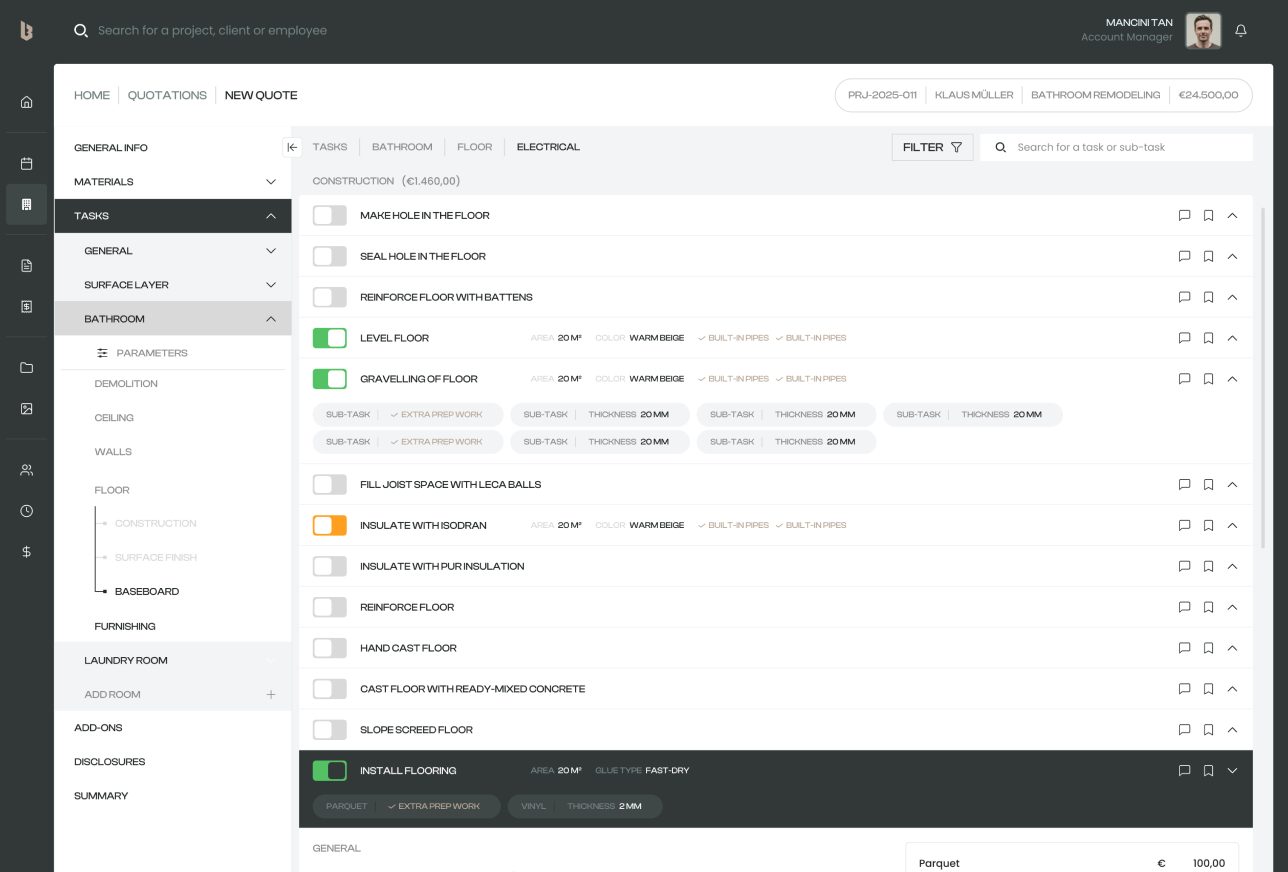
A quote is really a tree
Room, category, phase, task, sub-task. Five tiers, and every leaf has its own quantities and prices.
Bathroom, Floor, Construction, Install flooring, Parquet. The estimator needs all five tiers on one page or they lose their place. Then the same quote has to reach the worker laying that parquet, on a phone, outdoors, who wants exactly one task at a time. Same data, two very different readers.
Buildlr had a founder, a market and no product yet. So all of it was designed from zero, in a language I don't speak, for a client whose working day never overlapped with mine.
Five tiers on one page
The tree lives in the left rail, so you always know which room and phase you're in.
Tasks are rows you switch on with a toggle. Open one and its sub-tasks unfold inside it, each with its own parameters, while the cost panel on the right recalculates as you go. Only one task opens at a time. That rule kept the page readable at forty rows deep, and it took a few rounds to accept it as a feature.
The question lives in the form
Estimators kept getting stuck on things only the client could answer.
Which colour. Which finish. The old habit was to leave the line blank and chase it by email. So the request for information became part of the task. When a task needs a client decision, a suggested RFI appears right there, question pre-written and deadline attached, and the client answers it on their phone. The blank line stays visible until it's filled.
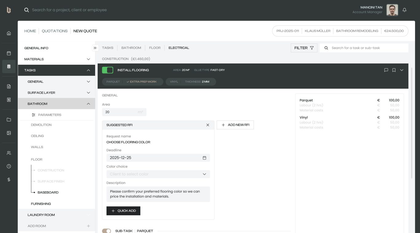
Same tree, one thumb
The field app reads the same quote, one worker at a time.
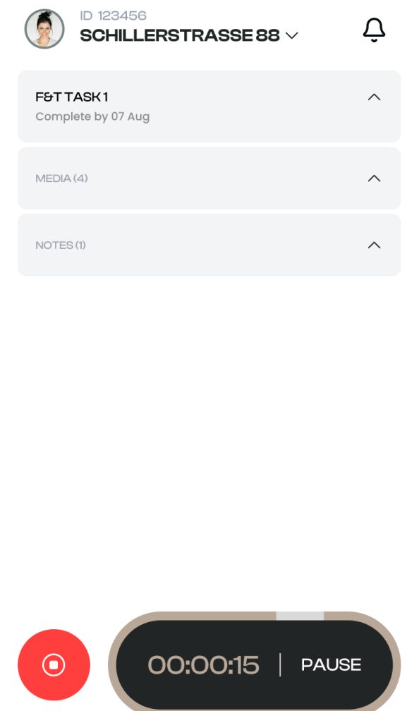
Rooms became filter chips along the top. Categories became accordions. Each task is a card, parameters are label and value rows, and sub-tasks sit one indent in, just like on desktop, so the hierarchy survives the move. Anything still waiting on the client is flagged in red inside the card, because nobody should find that out on a ladder. Once a task is running, everything collapses to three headers and a timer.
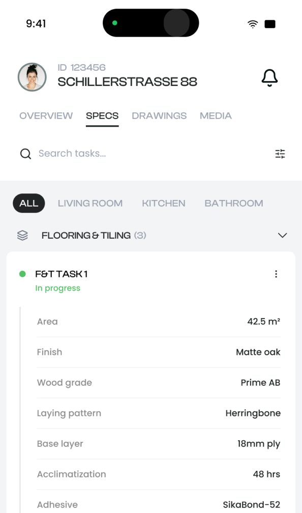
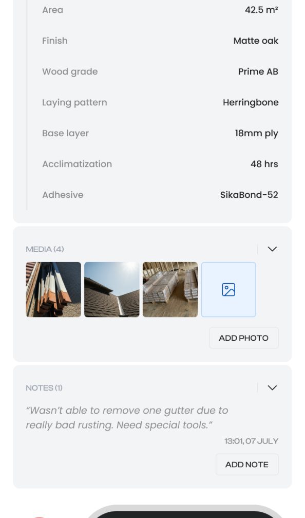
How each tier travelled
On desktop, one page, always in context. On mobile, one task, always in reach.
| Tier | Desktop | Mobile |
|---|---|---|
| Room | Left rail, always visible | Filter chips along the top |
| Category and phase | Rail children, collapsible | Accordion sections |
| Task | Row with a toggle, one open at a time | Card with a status line |
| Sub-task | Section inside the open task | Indented block inside the card |
| Parameters | Inline inputs with units | Label and value rows |
| Client decision | Suggested RFI, pre-written | Red "client to provide" block |
Seoul and Oslo share no working hours. The library has no token layer yet, since it was built for speed with a two-person team. Tokens are the first thing I'd add with more runway.
Got a form that keeps growing tiers?
I'd love to hear what you're working on.

Service recovery at scale
Ninja Van · Logistics